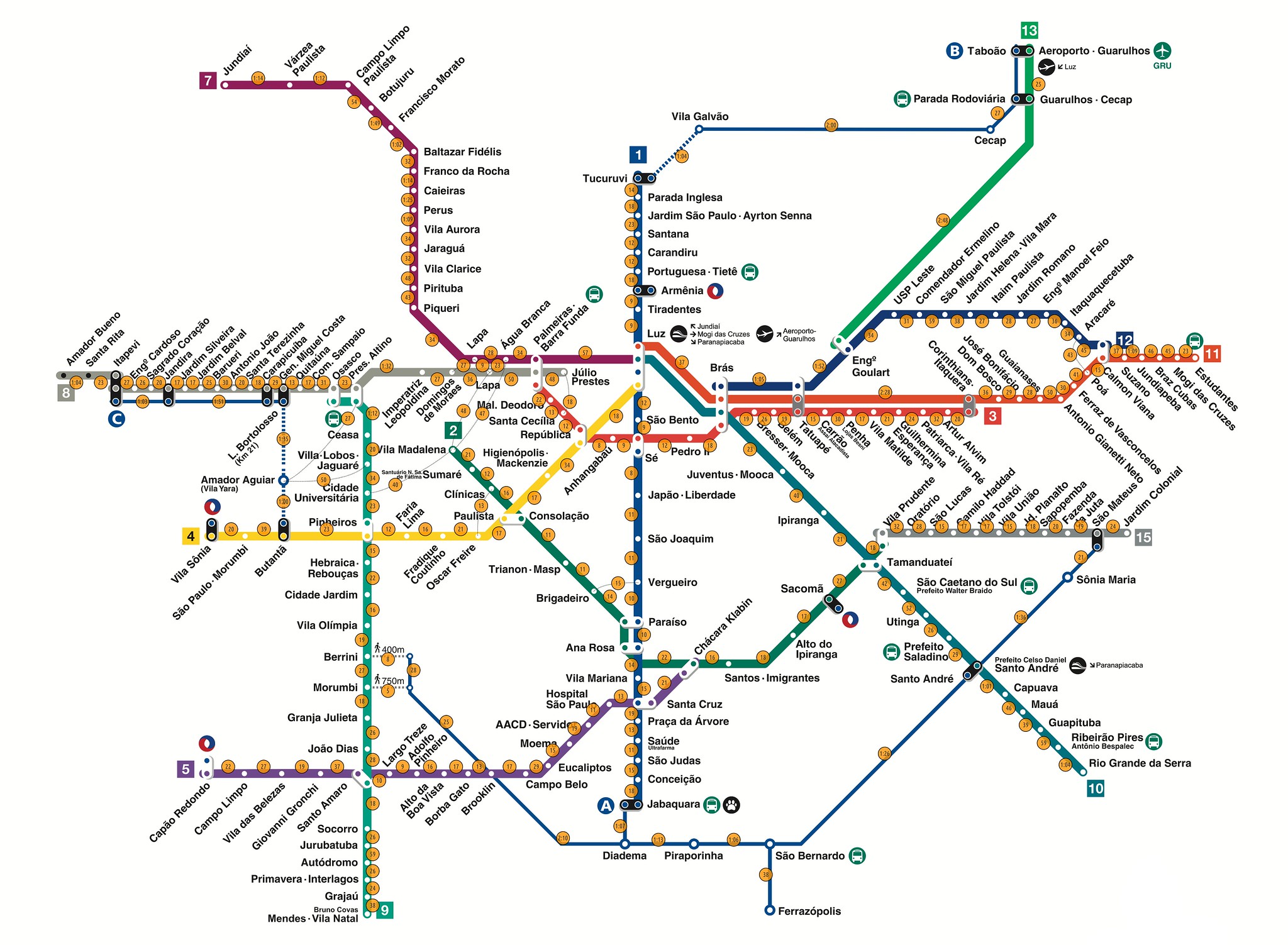
Like many, I find the typical design of public transport maps rather gorgeous. They speak to my imagination on several levels. There is the challenge of abstracting complex and rich information, simplifying as much as possible, but not more. Then, an extensive public transport network also speaks to the level of service the state provides to its people. More public transport dovetails with other policies that favour the working class. And, public transport maps are roadmaps for extensive local travel.
I adjusted the official São Paulo metro map, showing walking times between all adjacent stations, and between a few stations on different lines, but which are geographically reasonably close to each other.
My own main insight from this exercise is the emphasis on how incredibly huge São Paulo is. To walk between the two stations furthest apart, Jundiaí and Estudantes, would take more than 23 hours, uninterrupted.

